Rounded Corners in WFP
When you want to create a nice-looking UI, sooner or later you will at least consider rounding corners on some elements. In WPF, you need to use Border control for this.
Border control
Unlike in CSS, in WPF border is not a property, but its own control, which means that sometimes you have to move some stuff around in the visual tree by wrapping components in <Border>...</Border>, which can be a little inconvenient at times, e.g.:
<Grid>
    <Grid.ColumnDefinitions>
        <ColumnDefinition/>
        <ColumnDefinition/>
    </Grid.ColumnDefinitions>
    <Grid.RowDefinitions>
        <RowDefinition/>
        <RowDefinition/>
    </Grid.RowDefinitions>

    <TextBlock
        Grid.Column="0" Grid.Row="0"
        Text="1"
        HorizontalAlignment="Center"
        VerticalAlignment="Center"/>
    <TextBlock
        Grid.Column="1" Grid.Row="0"
        Text="2"
        HorizontalAlignment="Center" VerticalAlignment="Center"/>
    <TextBlock
        Grid.Column="0" Grid.Row="1"
        Text="3"
        HorizontalAlignment="Center" VerticalAlignment="Center"/>
    <TextBlock
        Grid.Column="1" Grid.Row="1"
        Text="4"
        HorizontalAlignment="Center" VerticalAlignment="Center"/>
</Grid>
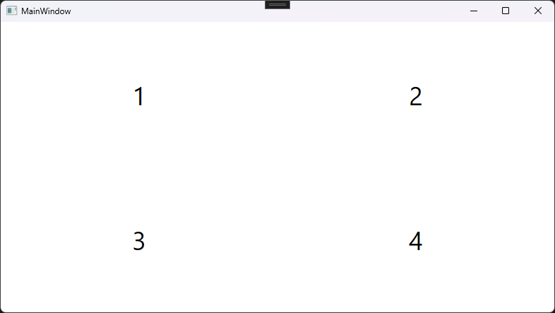
We have a simple 2 by 2 grid with a number centered in each one.
Now, let’s add a border to the number 4. Simply wrapping the 4th TextBlock in Border instantly breaks things.
<Border BorderBrush="Black" BorderThickness="2">
    <TextBlock
        Grid.Column="1" Grid.Row="1"
        Text="4"
        HorizontalAlignment="Center" VerticalAlignment="Center"/>
</Border>
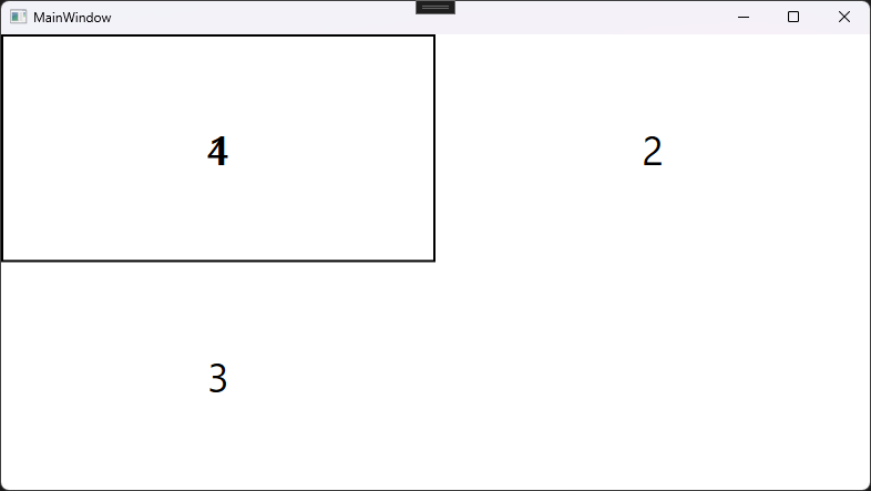
The first thig you notice, is the fact that the positioning is broken. Grid.Row and Grid.Column properties need to be set on direct children of Grid control, so in order to maintain the layout, they need to be moved to the Border.
You might also notice that the border doesn’t surround the TextBlock closely, but rather fills all space given to it by the Grid. Let’s fix the positioning and give some background color to the TextBlock to visualize the empty space between it and the Border’s border.
<Border
    Grid.Column="1" Grid.Row="1"
    BorderBrush="Black" BorderThickness="2">
    <TextBlock
        Text="4"
        HorizontalAlignment="Center" VerticalAlignment="Center"
        Background="Red"/>
</Border>
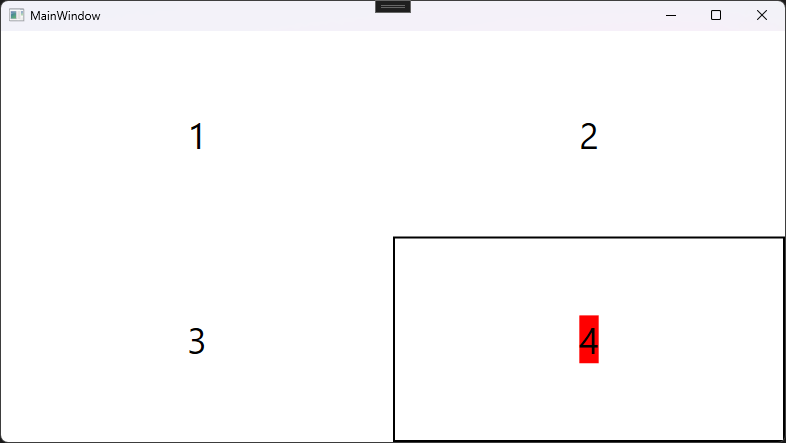
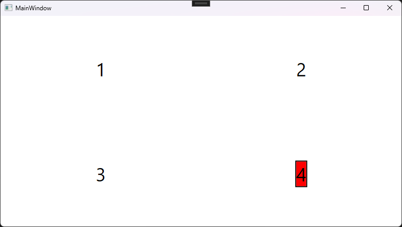
The reason for this empty space are the HorizontalAlignment and VerticalAlignment properties. On both TextBlock and Border they default to Strech. In our example, Border stretches as far as it can, while TextBlock doesn’t. If we move these properties to the Border, now its size doesn’t go beyond what the TextBlock needs.
<Border
    Grid.Column="1" Grid.Row="1"
    HorizontalAlignment="Center" VerticalAlignment="Center"
    BorderBrush="Black" BorderThickness="2">
    <TextBlock
        Text="4"
        Background="Red"/>
</Border>
Cutting corners
Let’s get to the rounded corners part.
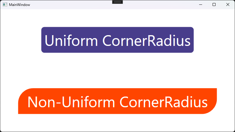
Border has a property called CornerRadius that accepts either one value that’s applied to all corners, or 4 values for each corner idependently (in order Top Left, Top Right, Bottom Right, Bottom Left).
<Grid>
    <Grid.RowDefinitions>
        <RowDefinition/>
        <RowDefinition/>
    </Grid.RowDefinitions>

    <Border Grid.Row="0"
            HorizontalAlignment="Center" VerticalAlignment="Center"
            Background="DarkSlateBlue"
            Padding="10"
            CornerRadius="10">
        <TextBlock Foreground="White" Text="Uniform CornerRadius"/>
    </Border>
    <Border Grid.Row="1"
            HorizontalAlignment="Center" VerticalAlignment="Center"
            Background="OrangeRed"
            Padding="30 10"
            CornerRadius="50 0 50 0">
        <TextBlock Foreground="White" Text="Non-Uniform CornerRadius"/>
    </Border>
</Grid>
It works great as long as the content doesn’t overflow. Let’s change some things around to make this example look a little worse:
<Grid>
    <Grid.RowDefinitions>
        <RowDefinition/>
        <RowDefinition/>
    </Grid.RowDefinitions>

    <Border Grid.Row="0"
            HorizontalAlignment="Center" VerticalAlignment="Center"
            BorderBrush="DarkOrange" BorderThickness="5"
            CornerRadius="10">
        <TextBlock Foreground="White" Background="DarkSlateBlue"
                   Text="Uniform CornerRadius"
                   Padding="10"/>
    </Border>
    <Border Grid.Row="1"
            HorizontalAlignment="Center" VerticalAlignment="Center"
            BorderBrush="Black" BorderThickness="5"
            CornerRadius="50 0 50 0">
        <TextBlock Foreground="White" Background="OrangeRed"
                   Text="Non-Uniform CornerRadius"
                   Padding="30 10"/>
    </Border>
</Grid>
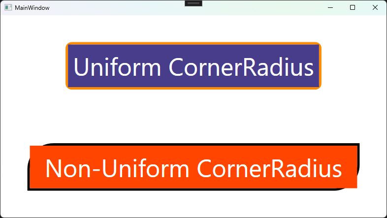
When I moved the responsibility for determining the background color to the child of Border control, the effect broke. It turns out that CornerRadius is able to hide only the background set by the Border itself, but its children are displayed in full. Our situation is simple to fix - we could go back to the initial version that worked fine, but most things are more difficult not to overflow than TextBlock with transparent background, like Image or ScrollViewer. In CSS you could use overflow: hidden; in this situation, but in WPF it’s not as straightforward.
Hiding overflow
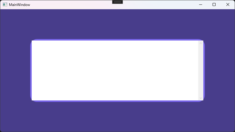
Let’s try to give a ScrollViewer rounded corners.
<Grid Background="DarkSlateBlue">
    <Border Margin="100"
            BorderThickness="5" BorderBrush="MediumSlateBlue"
            CornerRadius="20">
        <ScrollViewer VerticalScrollBarVisibility="Visible" Background="White"/>
    </Border>
</Grid>
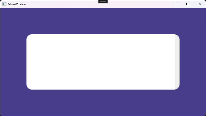
The trick I use is to use OpacityMask with VisualBrush. I wrap my control in a Grid (because it lets me put all its children on top of one another) and unwrap it from the Border. Now, Border and ScrollViewer are both direct children of the new Grid. Since they both stretch to fill the Grid, they are about the same size.
Now, I want to tell the Grid, along with its children, to be visible only where the border is visible. For that, inside the Grid I specify Grid.OpacityMask and give it a VisualBrush child with Visual property bound to the Border. For that to work properly I need to:
- Specify
x:Nameof theBorderto be able to refer to it in the binding, - Set the
Backgroundproperty of theBorderto something non-transparent - Remove
BorderThicknessof theBorder, because it causes visual artifacts - Set
Stretch="None"onVisualBrush, because if the grid is not the same size as the control that uses it as the mask, we usually don’t want the mask to be stretched to fit it.
<Grid Margin="100">
    <Grid.OpacityMask>
        <VisualBrush Visual="{Binding ElementName=cornerRounder}" Stretch="None"/>
    </Grid.OpacityMask>
    <Border x:Name="cornerRounder"
            Background="White"
            CornerRadius="20"/>
    <ScrollViewer VerticalScrollBarVisibility="Visible" Background="White"/>
</Grid>
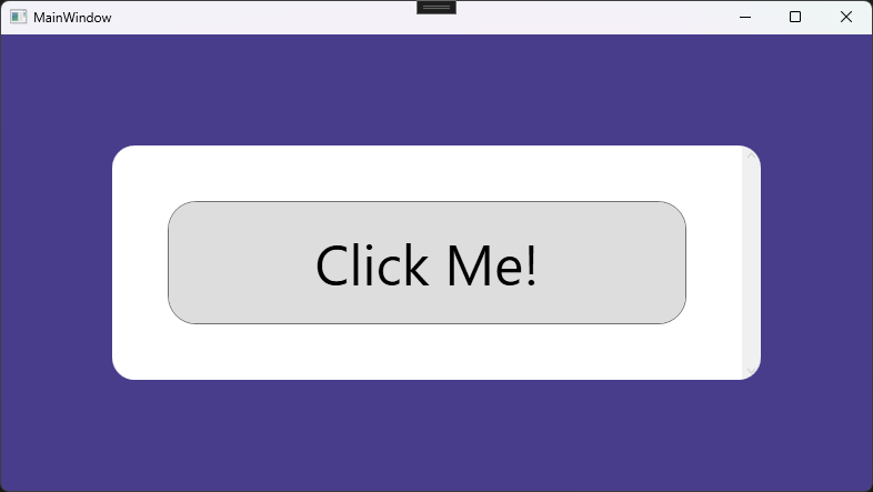
Rounded buttons
One of the most common use case for rounded corners is a Button. Luckily, all of this is not necessary. Button is acutually composed of other controls, one of them being Border. You can quite easily modify its style as by giving the Button it a style resource that targets Border type.
<Button Margin="50">
    <Button.Resources>
        <Style TargetType="{x:Type Border}">
            <Setter Property="CornerRadius" Value="25"/>
        </Style>
    </Button.Resources>
    Click Me!
</Button>
Sources
I learned the methods shown here most likely from these StackOVerflow threads: